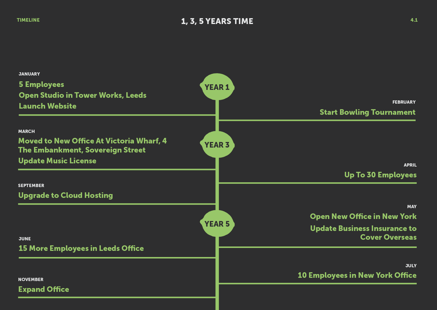
I put the presentation together.
I thought we could have a screenshot from google maps of the studio location, and then put our logo over it so you can see where it is.
For the manifesto, I thought about having it fill the screen to be bold and stand out. Usually I don't like text covering the screen, but I thought it was appropriate in this case.
For our services I thought about having our lime icon
I thought about having key words in green.
But I felt this was way too much info.
I put in a screenshot of the printers we are going to use.
I made some icons for the hosting page.
Here is the res of the development for the pages.
It took me quite a while to work out how to arrange the costs of everything, because I wanted to make it easy to digest and make sense.
Here is the final presentation:


No comments:
Post a Comment